
The House Of Yoga
THE HOUSE OF YOGA
FULL REBRANDING, RENOVATION OF A COMMERCIAL SPACE AND INTERIOR DESIGN PROJECT FOR THE HOUSE OF YOGA, A WARM AND EARTHY YOGA STUDIO LOCATED IN BRUSSELS.
The brief
When we got contacted by entrepreneur Elena Gaita to work on her new yoga studio project in Ixelles, Brussels, we couldn’t be more excited: yoga students ourselves, we were dreaming of a welcoming and cool place where to attend classes from early morning to late evening, surrounded by a friendly community of fellow yogis.
The brief was as simple as challenging: taking care of the full rebranding of what had been until then a side project with a small community -now aiming at becoming one of the main yoga studios in town- and bringing to life its interior space. At that moment, the research for the perfect place was still ongoing.
We fell immediately in love with the studio concept: an inclusive yoga studio aimed at helping people get closer to the kind of yoga that work best for them -no matter their age, gender and body flexibility- while reconnecting with their deepest self. All this was already enough to start imagining a brand new universe that could offer a one-of-a-kind yoga experience in town.
1. BRAND DESIGN
The concept
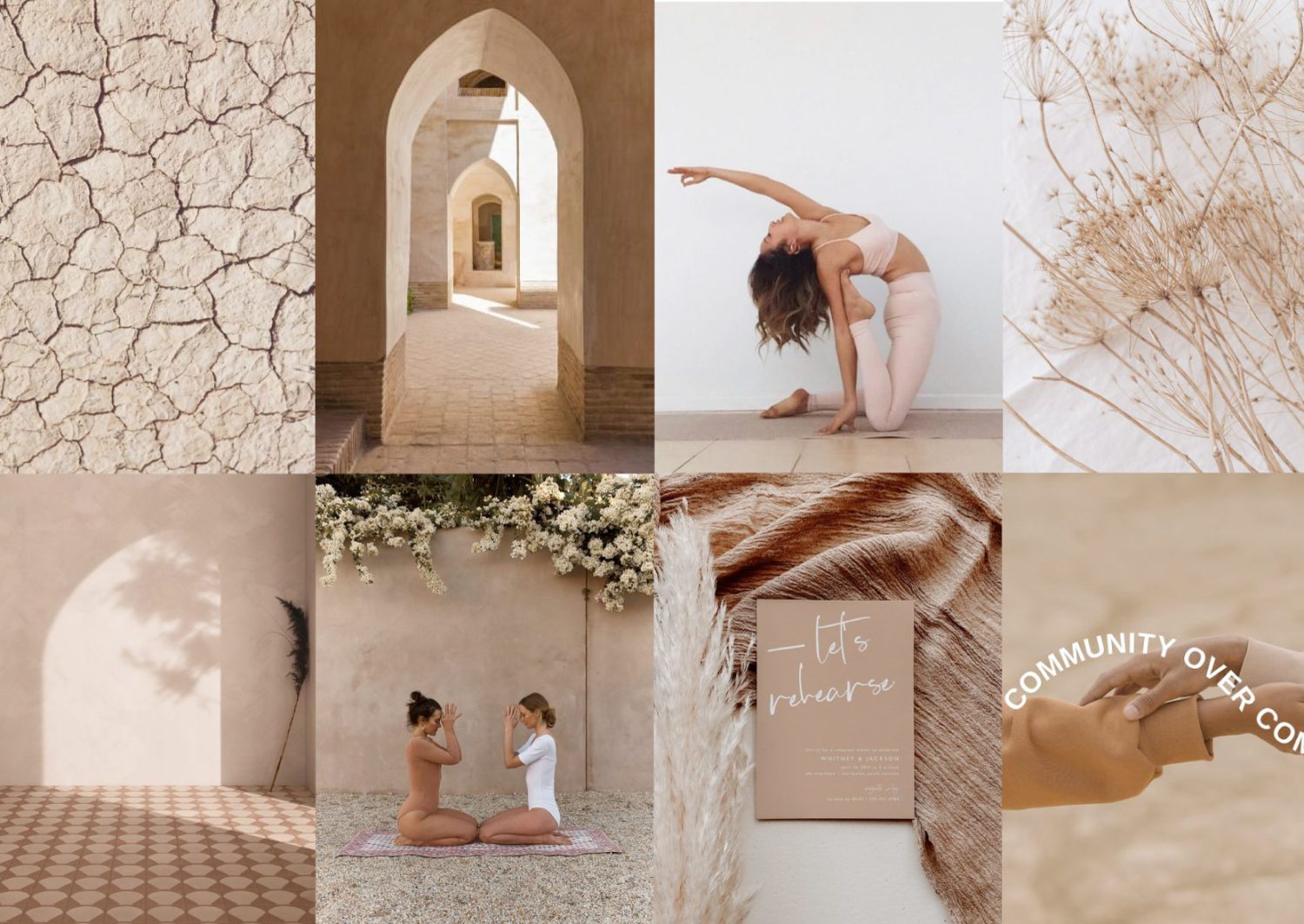
For the new brand identity of The House Of Yoga we’ve put together a colour scheme of earthy, warm and nude tones that invite us to calm down, be grounded and connect with to our inner roots. Curvy lines and dynamic compositions highlight the sense of flow and evolution which are linked to yoga, but also help spread a feeling of kindness and inclusion.

THE LOGOS
We designed a set of flexible logos to adapt to different media and get assembled in different ways depending on the communication purpose. We created the main logo starting from three circles -soul, mind and body- which overlap to create the true essence and “house” of human beings: we are our temple, and the house for yoga practice. The main circular logo is accompanied by an initial logo (HOY), to be used as submark. To synthesise the mission and values of the studio, the brand claim “yoga, your own way” has been conceived.
GRAPHIC SYSTEM
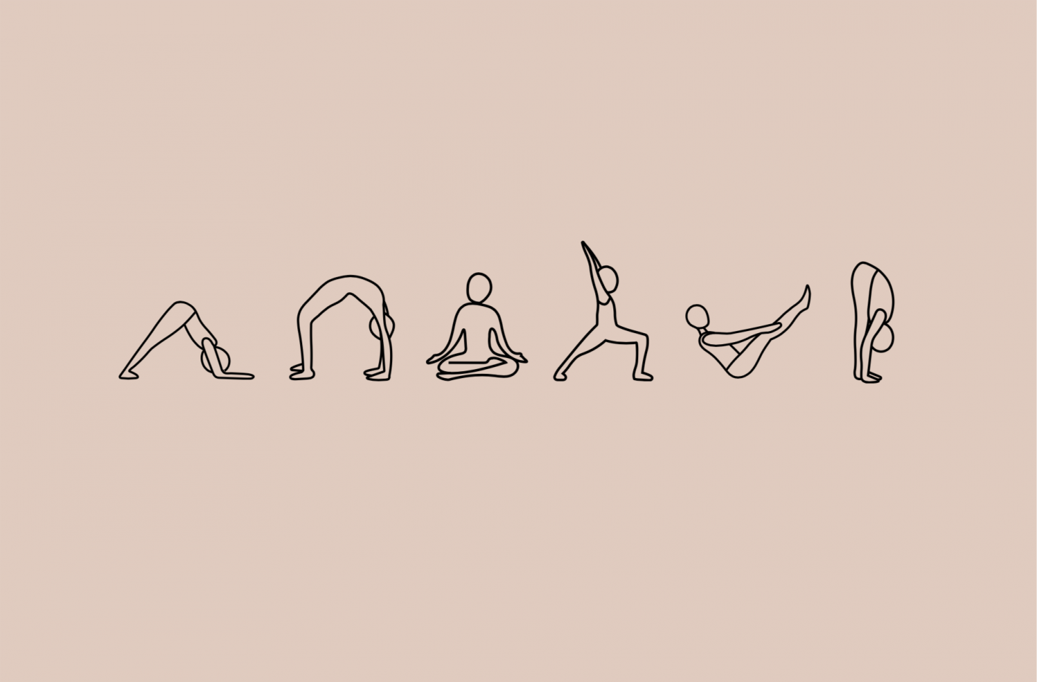
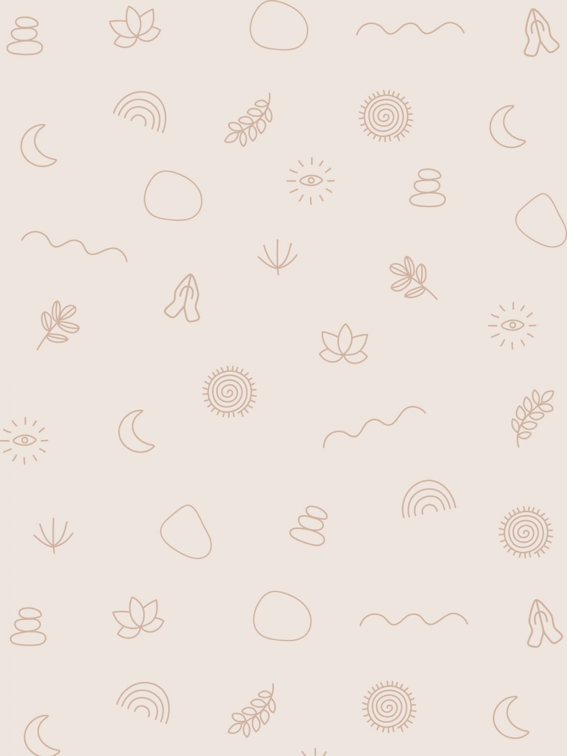
We also had fun creating a set of pictograms representing objects and symbols linked to the yoga and nature universes (lotus, praying hands, eye, stones, moon, waves) together with a set of asanas (yoga poses). These pictograms can be combined together in patterns or be used alone in playful ways, online and offline.

2. INTERIOR PROJECT
THE SPACE
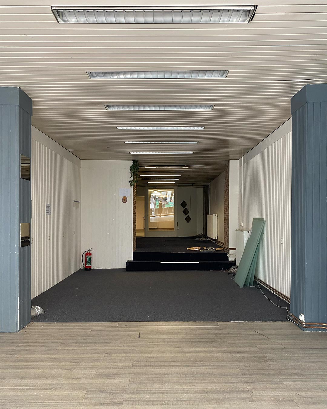
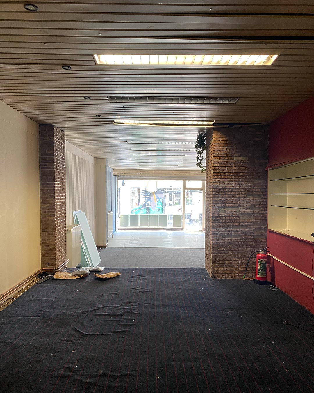
While we were busy developing the new brand identity and creating all the design guide lines for its implementation online and offline, a commercial space with the required size and features became available in the perfect city area: Saint Boniface. The space, to be completely renovated, has a surface of 180sq.m, a large room in the back and takes advantage of a big shop window on one of the most crowded streets of the neighbourhood, Rue de la Paix.
SPACE PLANNING
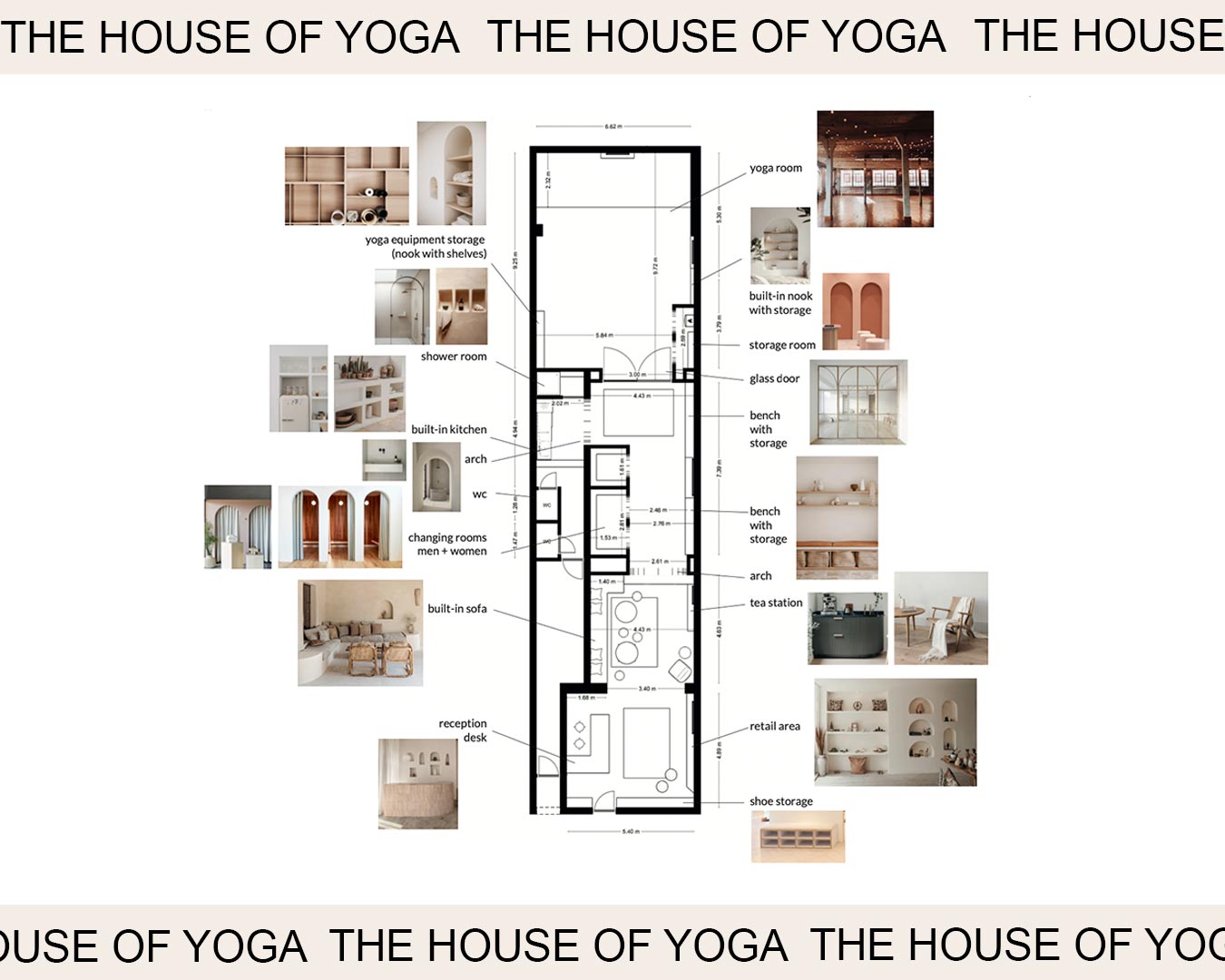
We got inspired by the architectural features of the space and the lack of natural light to create an intimate and welcoming yoga shelter, with references to Moroccan decor and Hammam architecture: a regular sequence of rooms brings you from the reception hall to the yoga room, at the back of the studio. We spent considerable time imagining how yoga students will interact with the space and what they will need at every stage of their indoor journey, so to plan the rooms layout at its best. We eventually decided to design a reception hall at the entrance, a community area for gathering before and after each session, and a changing area adjacent to the yoga room.
THE WORKS
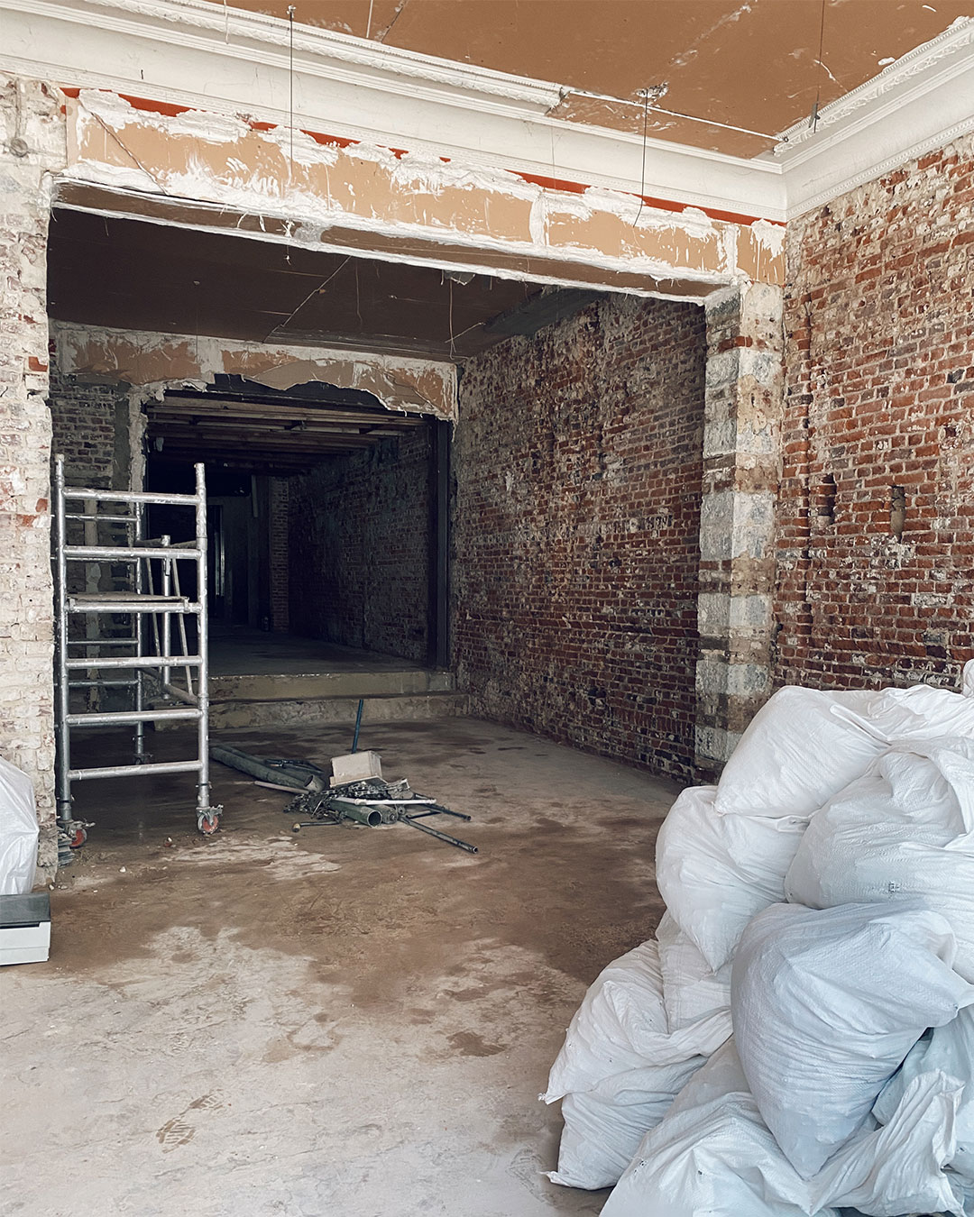
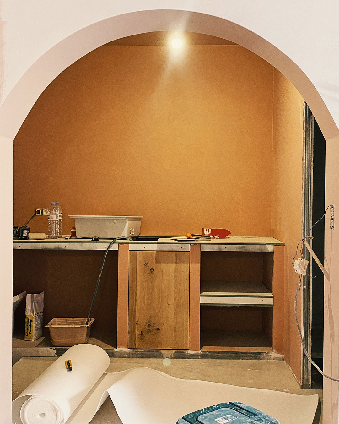
The demolition works started in June 2022 – it took several weeks to remove the dropped ceiling, the flooring, the wall paneling and covering, the electric and plumbing system. It passed no day without discovering something unexpected coming up from the ashes of the former shop.
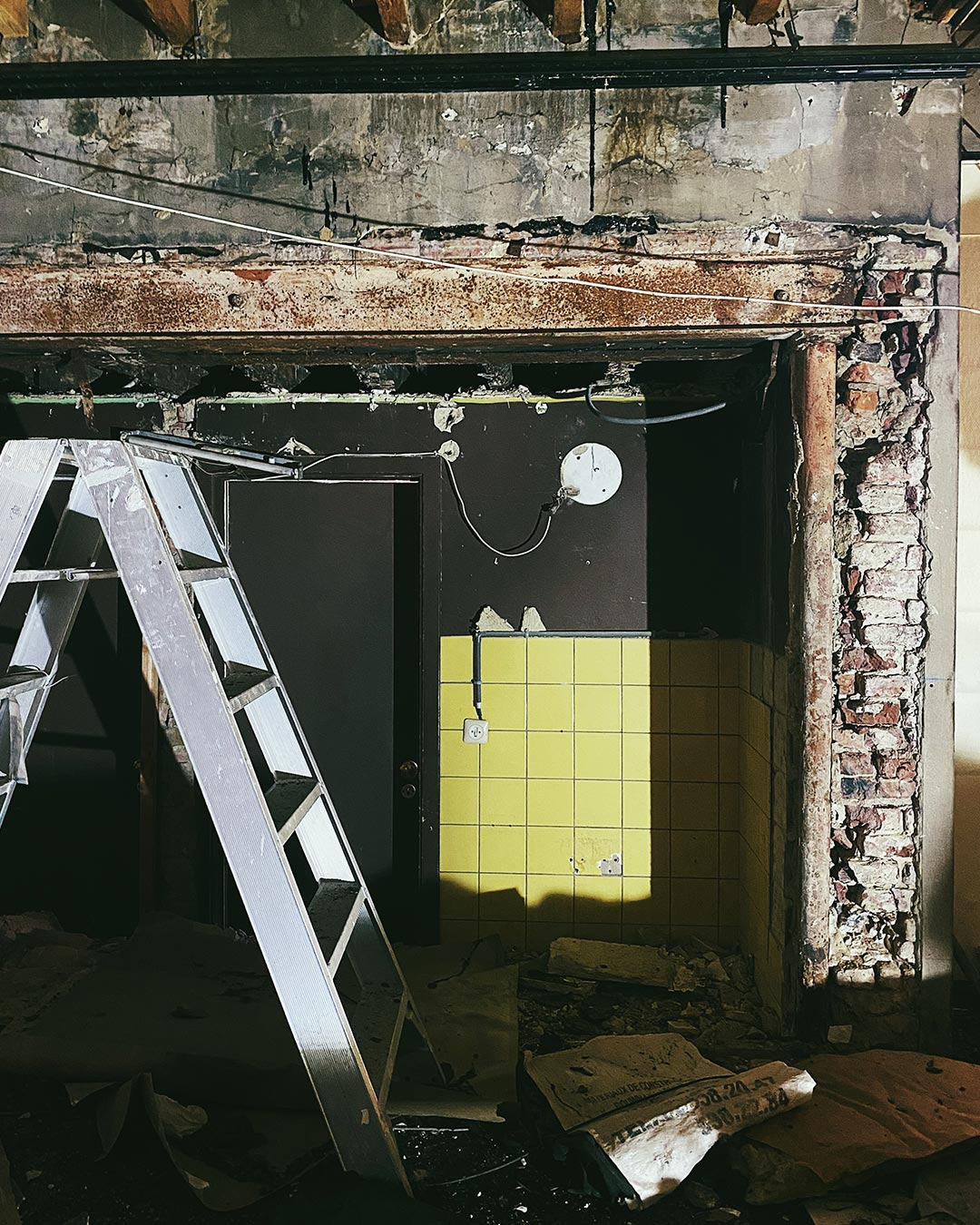
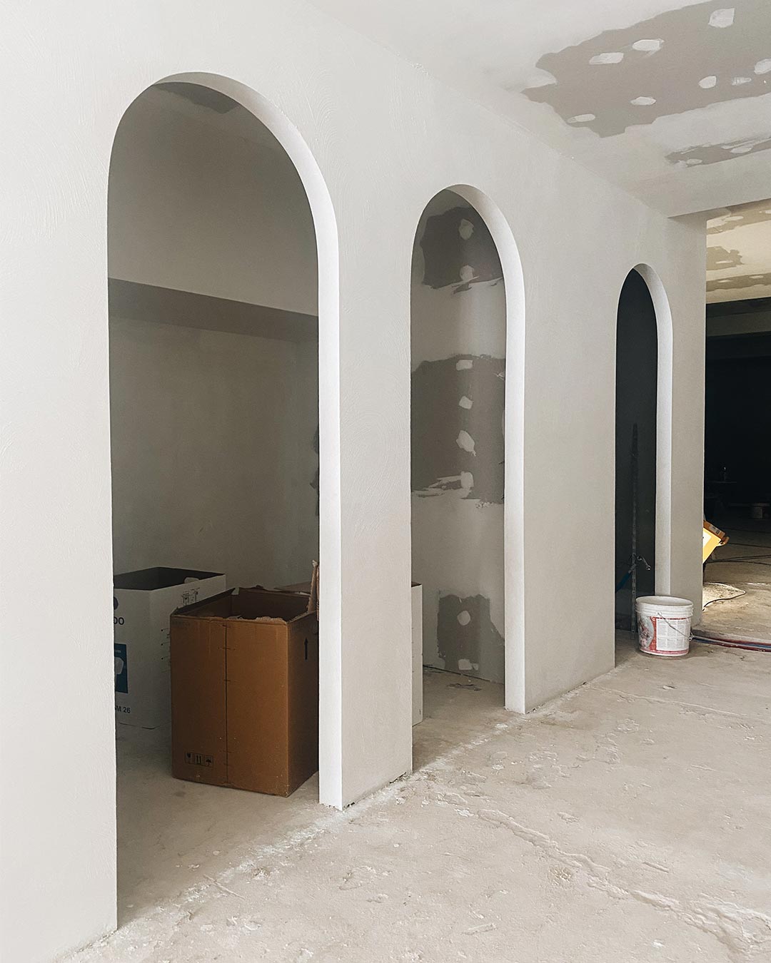
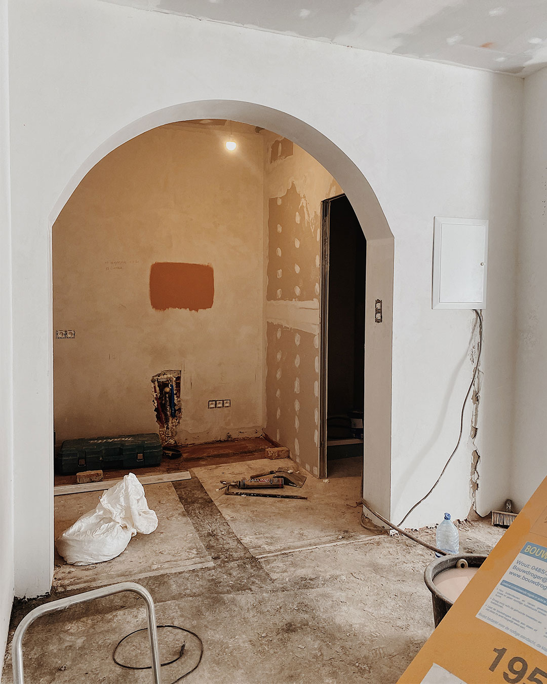
To optimise the space, we turned the former storage room of the shop into two changing rooms, whose concept was inspired by the fitting rooms you are used to find in retail. We designed arched doorways to access the changing rooms and the kitchen/toilet area, so to add movement and a sense of flow in an otherwise squared and linear space.
LIGHTING
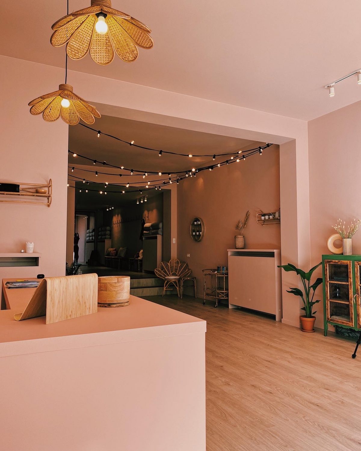
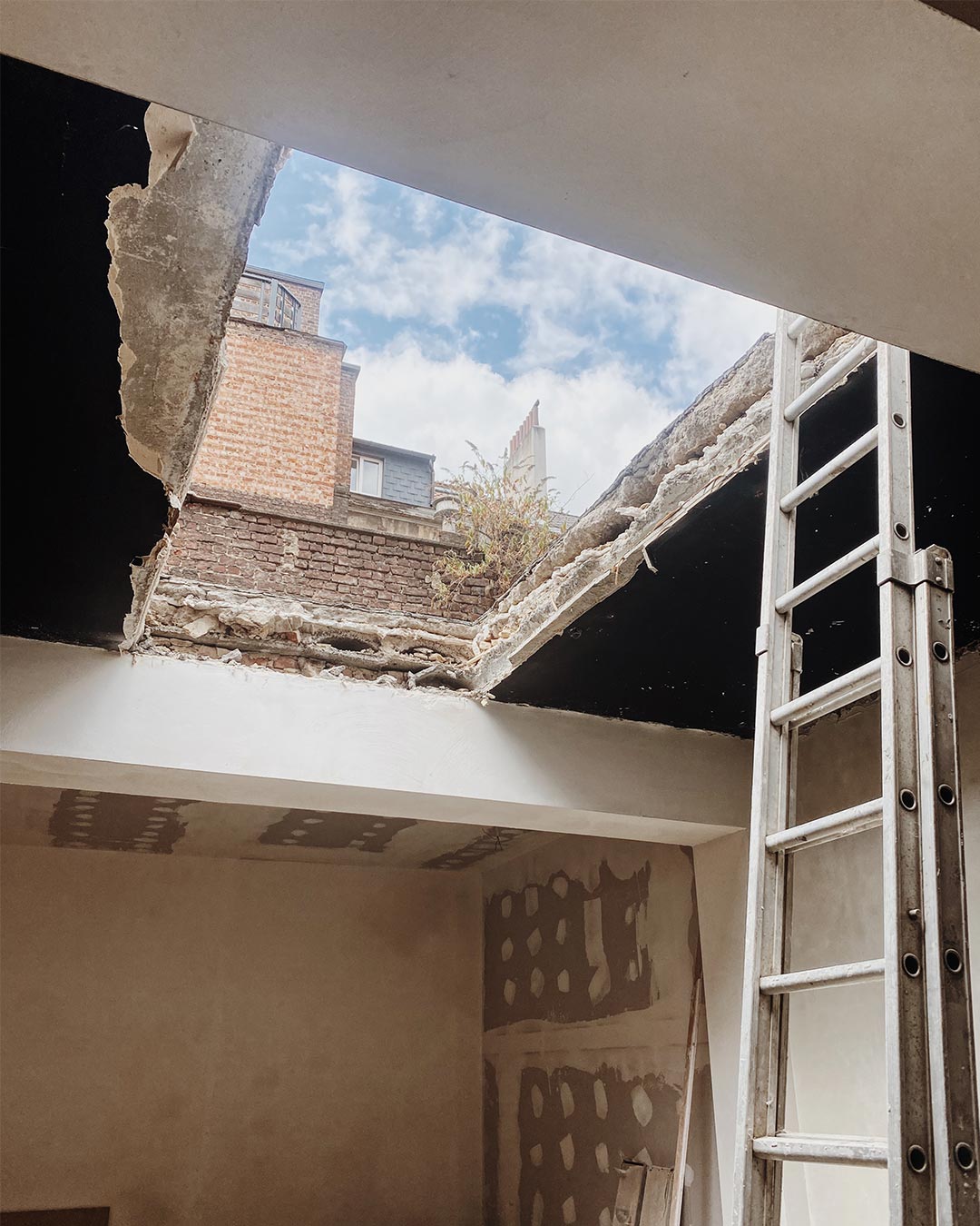
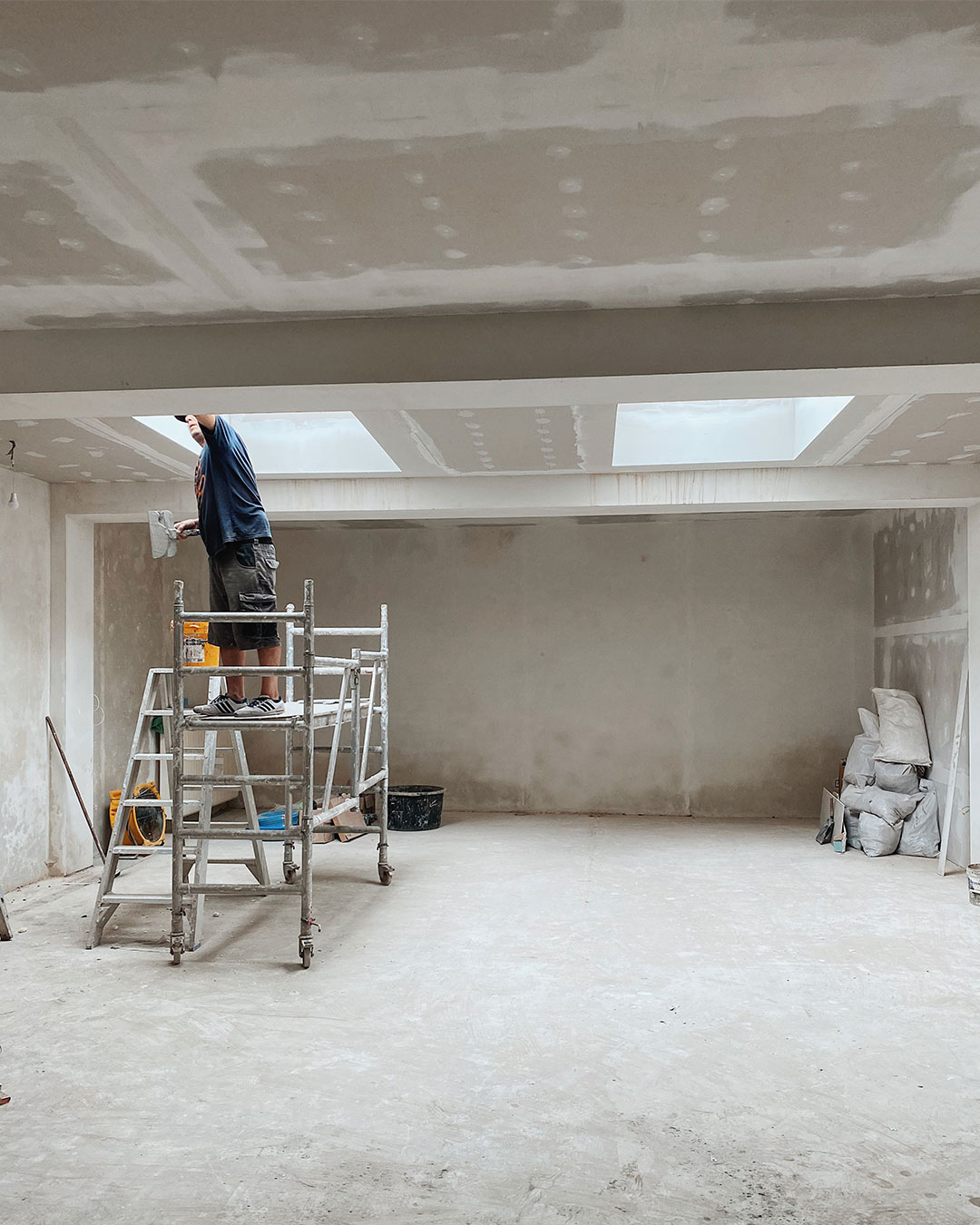
As the whole interior lacked of natural light, we paid a particular attention to artificial lighting: rattan shades creating soft shadows, dreamy light chains hung on the ceiling and modern spotlights for general lighting balance each other to bring to life a cosy, calming yet functional space. In order to allow natural light to enter into the yoga room, we opened two skylights in the ceiling. We eventually added warm-light led stripes in the yoga room to complement the general lighting, so to create a soft and relaxing atmosphere during evening classes. A beautiful glass door separates the yoga room from the rest of the space, while allowing light to pass through.
DECOR
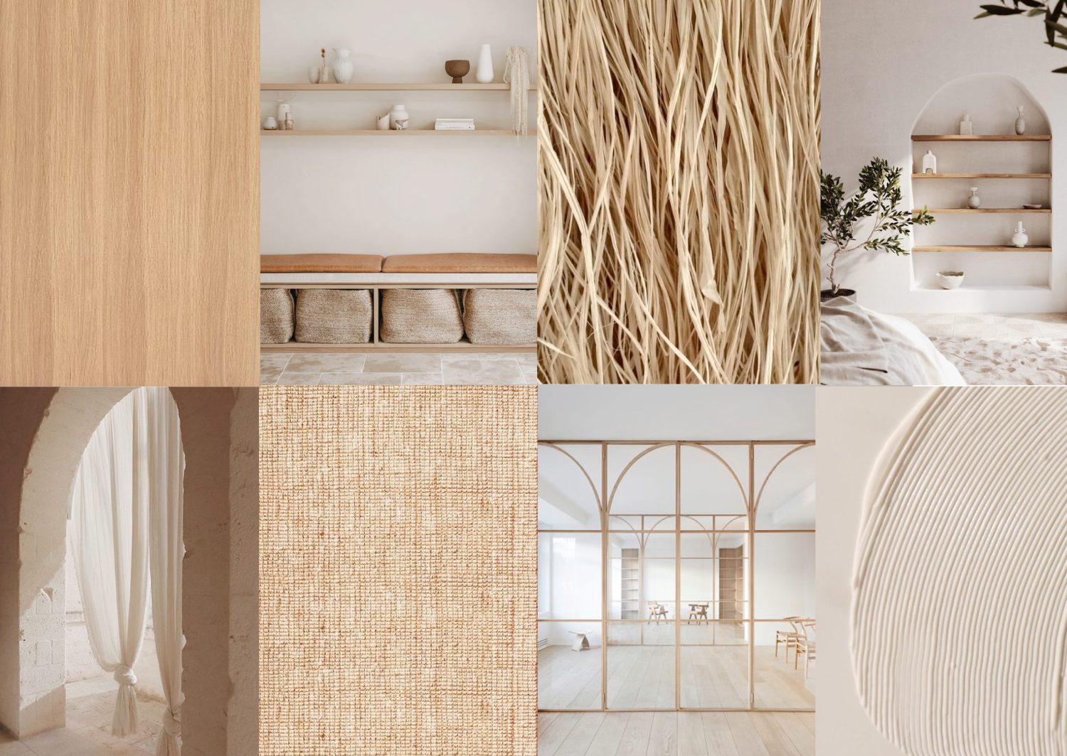
In order to create a warm and safe environment that could be able to welcome a wide variety of yoga students, we proposed to bring to life an earthy and rough space, filled with neutral colours and natural materials, where to easily connect with the ground, our body and soul: unpolished walls, terracotta tones, bamboo, rattan, cotton and organic shapes work in harmony to encourage a sense of calmness and warmth.
A warm and earthy colour scheme ties together the design of the studio: lighter tones are used in the communal areas, while deeper shades darken the walls of changing rooms, kitchen and service area. Black metal details and colourful cushions are the only elements that create contrast and depth in an otherwise monotone interior.
A neon light saying “All we have is now” on the reception wall invites yoga students to leave daily stress and thoughts outside the door, and to focus on the present moment.
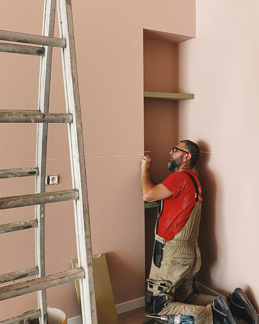
Have a look here to discover the pictures of the completed project.
The House Of Yoga opened its doors in September 2022, after 4 months of works. The design project started in January 2022 and took 9 months to be completed.
enjoyed this article?
sign up for our newsletter!

